5 Colours To Consider When Redecorating
By Jim (11/07/2016)


When you’re re-decorating your house, there is a world of potential opened up to you.
Some of you may have been planning for months (or years!) about your new colour scheme - some may simply have moved into a new house and want to start afresh.
Either way it can be all too easy to drift into the time-honoured cream carpet and magnolia walls - very good in their own way, but nothing to write home about.
Here’s a few suggestions for often neglected colours which can make a great finishing touches to your house…
1. Yellow
Where?
Hallway, Landing, Front Room
Why?
There has been much debate on yellow - on the one hand, it is associated with all sorts of nice things - sunshine, happiness, optimism, energy - it was even shown in one study that yellow and other warm colours helped participants remember things.
On the other, some folks think it’s possible to overdo the colour - that is the case with most bold colours of course, but a splash of yellow generally helps to lighten and mood and, because it is a highly reflective colour, it will literally brighten up the space!
Using it in smaller spaces like hallways and landings will prevent any yellow over-load whilst making full benefit of its positive qualities.
Accents and Complimentary Colours
Grey, White, Black
Find Our Range Of Yellow and Gold Remnants
2. Teal
Where?
Bathroom, Office
Why?
Did you know the colour of products can make them sell better?
I’m sure you did, because we have a very knowledgeable audience here, but just in case you hadn’t noticed the colour of the following: your toothpaste, your mouthwash, antibacterial hand wash, doctor’s latex gloves...all fitting on that same blue-green colour spectrum.
Why? Cleanliness.
Blue-green colours, like teal (aka aquamarine, turquoise or cyan) speak of a health, air and freshness - all things you want your bathroom to encompass!
This can apply to office spaces too - these fresh colours can help you clear your mind and feel ready for work...or browsing Pinterest for interior decor ideas, whichever you prefer!
Accents and Complimentary Colours
White, Grey, Yellow
Find Our Range Of Blue and Teal Remnants
3. Red
Image Source: Brinton's Carpets
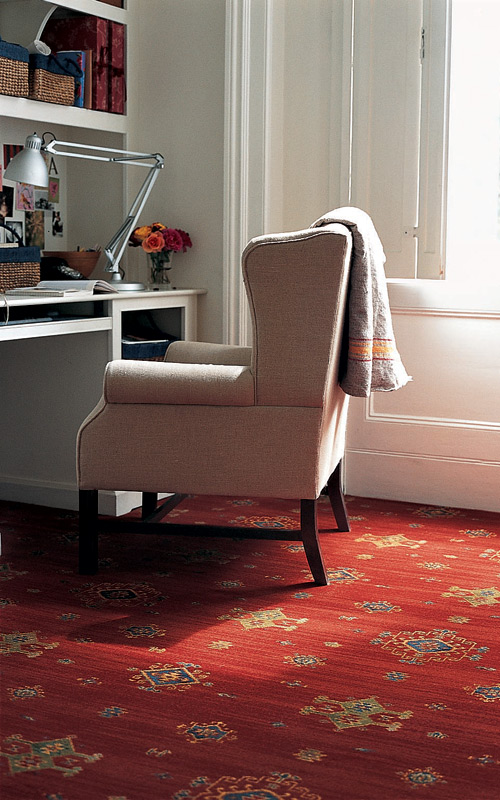 Where?
Front Room, Dining Room
Why?
When you usher people into your front room, the first sensation you want is one of hospitality and comfort - this can be achieved in multiple ways, but given the propensity of British weather to be chilly and damp, warmth is always a winner, and red is the king of warm colours.
The psychological connections we have with red have been detailed extensively, and it almost always comes back to warmth, attraction and passion. So roll out the red carpet for your guests! (NB: If you want to know where we get the term ‘red carpet’, you can find out on our last blog
For the dining room, the psychology is just as powerful. Red is a colour typically associated with rich flavours - assuming you are a meat-eater, the colour red should get you licking your lips - and let’s not forget wine, cherries, apples and strawberries all fit into this palette too! The first bite is with the eye, and a red colour-scheme will make it a tasty one!
Accents and Complimentary Colours
Green, Black, Gold, Cream
Find Our Range Of Red. Purple and Pink Remnants
4. Brown
Where?
Bedroom, Front Room
Why?
Brown is, of course, the recognised colour of nature - autumn leaves, bark, honest-to-goodness dirt, it’s all brown.
Much like red, brown can really conjure up a sense of warmth, but it’s more subtle than it’s passionate cousin - plus, all shades of brown play nicely together. A coffee-cream next to a dark chocolate? Fine. A fiery vermillion next to a ruby red? Not so much.
In both bedroom and living room these natural tones produce a feeling of comfort and relaxation - just what you need after a hard day.
Accents and Complimentary Colours
Cream, White, Lighter/Darker Browns
Find Our Range Of Brown Remnants
5. Black
Image Source: Cormar Carpets
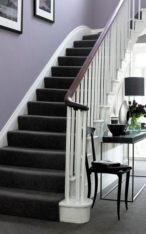
Where?
Bathroom, Hallway, Front Room
Why?
Black is often used as an accent in most rooms, but going all out isn’t as common. You do need a fairly airy space to make sure black decor doesn’t drain all the light, but when done right black gives a room a classic elegance.
Using it in the bathroom has a very pleasing effect, in two ways - firstly, with a mix of black and white you can create a high-contrast room, causing certain items or areas to ‘pop’ catching the eye.
On the other hand, you can choose a darker tile for the majority of the room - perhaps slate, rather than true ‘black’ - this can turn an ordinary bathroom into something modern, clean and super-classy - something that wouldn’t look out of place in a swanky hotel!
Accents and Complimentary Colours
Grey, White, Silver, Copper
Find Our Range Of Black Remnants
Well, that’s it for now! We hope there was some inspiration there for any redecorating projects you’re thinking of embarking on, and of course if you do decide to go wild with your colours, we have all sorts of remnants to help you out! Until next time, then, best of luck with making your home fantastic!
Price (Low-High)
Price SQM (Low-High)
Enter your required size for our most accurate pricing and availability.