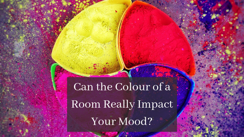
Can the Colour of a Room Really Impact Your Mood?
By Francesca Douglas - (06/08/2019)


Colour is one of those things that can be taken to mean anything – depending on who you speak to and in what situation they find themselves when you ask.
For those who read Jane Eyre in their school days, you will be aware of the iconic 'red room' which, to the character of Jane and subsequently to the reader through her first-person narrative, comes to symbolise terror and imprisonment. On the opposite end of the scale we could look at the widespread use of the colour pink as something feminine, romantic and joyful. There is a reason why baby girls are often wrapped in pink blankets – because pink is a colour rarely if ever linked to something negative.
It’s fair to say then, that authors certainly use colour as part of the psychology of their work, and the same could be said of painters; who use light and bright colours or dark dull colours depending on the mood depicted in their work. If they do it, why not interior designers?
It’s worth noting that often when you walk into a room, the actual colour on the walls is not necessarily the first thing you notice. What you will notice however is things like brightness; how welcoming is the room? How much light is there? Is it somewhere where you want to be? All this is directly influenced by the colour of the walls and floors, whether making a bold statement or otherwise. Let’s have a look at some different colours and the impact they can have on how you feel.
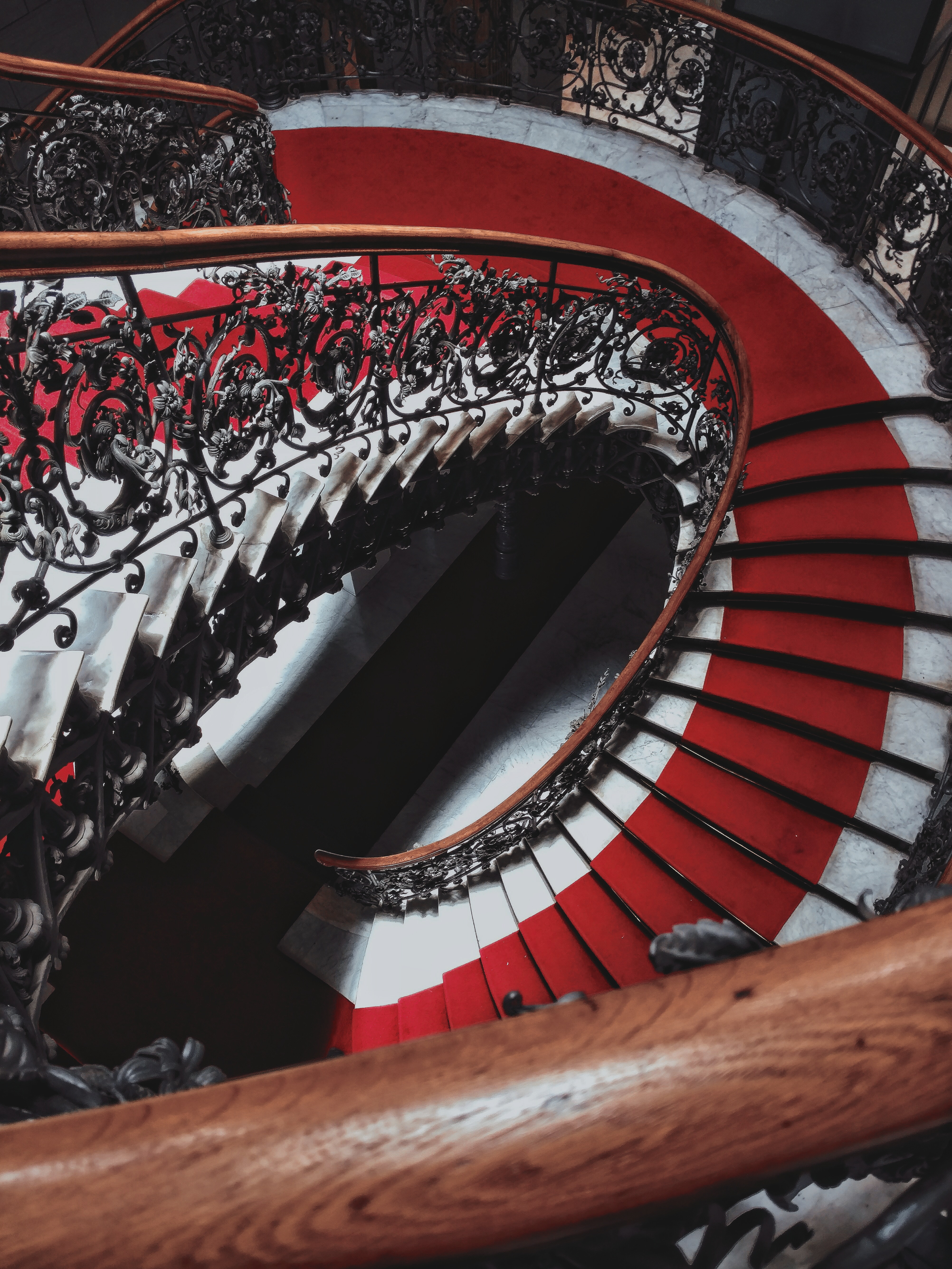
Red
Red is typically an intense colour. Like in the Jane Eyre example, it can often signify danger or terror as the bold tone can make a small room feel even smaller and the walls feel more confining. However red can also put one in a warm mood, and with the right light can actually create a rich and inviting environment - particularly in a social space within the home. Pairing red with the right flooring is key, as a dark wood or carpet can often push the room to look smaller. We would recommend pairing red walls with a light deep-pile carpet when looking to create an inviting atmosphere.
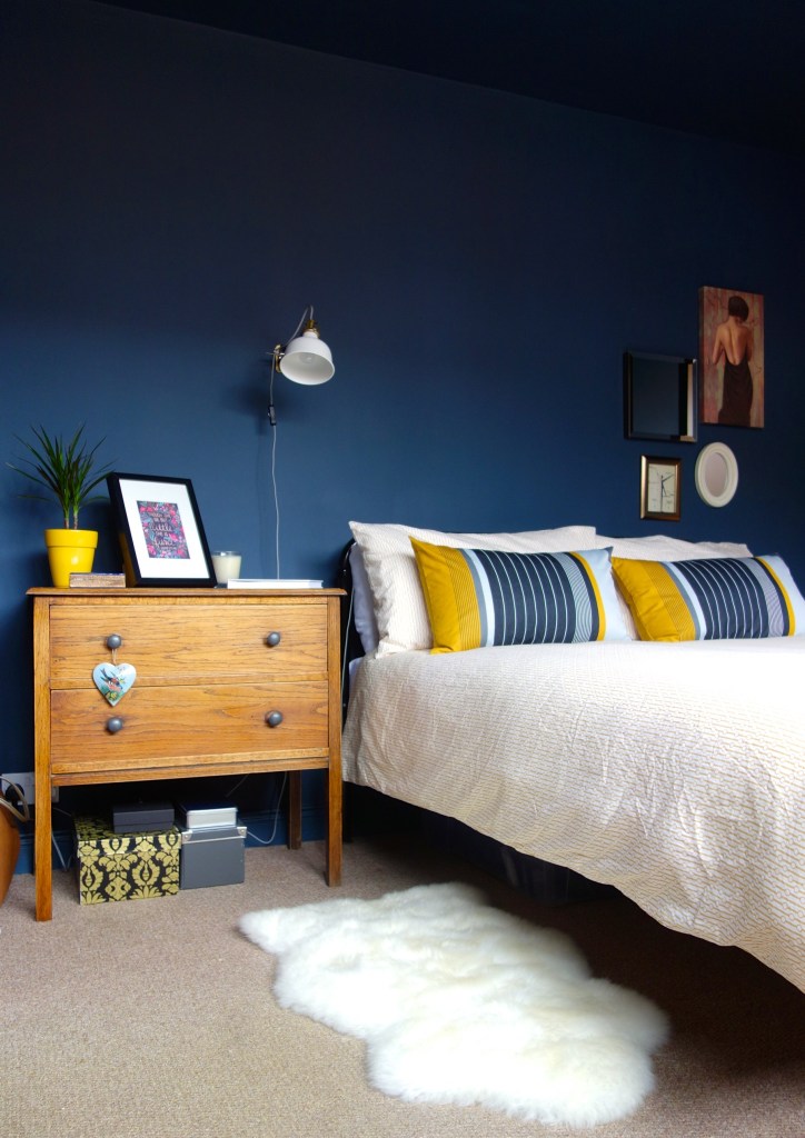
Blue
In contrast to red is blue – a calming colour that promotes serenity and an inviting feel of cleanliness. Often blue is used for bathrooms and will be paired with a light tile or hardwood floor, though it is equally as effective in bedrooms when paired with a light flooring. Depending on the chosen room, there is a risk of blue feeling quite cold and uninviting – think the character of 'Sadness' in Pixar’s ‘Inside Out’ who personifies the statement 'feeling blue'. This is why selecting comfortable furniture is key, for example a great carpet in a bedroom or some fun extras in a bathroom. My top recommendation would be a few real plants to add some life to any dull or slightly chilly room!
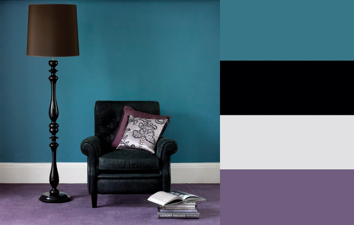
Purple
Purple is an interesting one and can be heavily impacted by the shade you opt for – whether a rich luxurious velvet purple, or a much lighter lilac version. The latter is distinctly playful and young, while the former version exudes elegance and mystery. When used as a secondary colour in a room purple can be a great way to accentuate areas of the room or décor, and if paired with a pale coloured carpet can be quite a regal way to style a room. Historically purple as a colour would have been used as a sign of wealth, and even today is still linked to royalty and power.

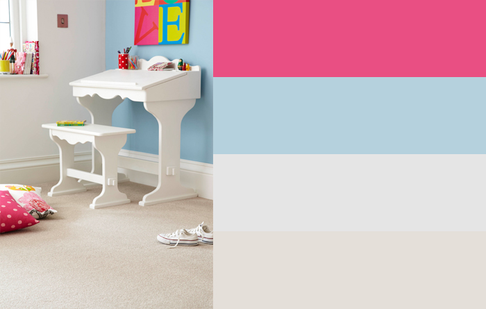
Yellow
Yellow is a personal favourite of ours, and when used right can bring an uplifting sense of cheer to any room in the house. There is a reason why many hospital walls and treatment rooms are painted a pale shade of yellow – the bright tone reflects the cleanliness of the room while the uplifting shade promotes positivity and energy. Having said that, if the yellow is too overwhelming it has been linked to increase frustration and stimulate feelings of anger, making it a strong contender for the role of coloured accent in your house rather than foundation or base.
Neutral
Finally, we come to the neutral tones most often associated with 'modern' decorating. Using a neutral shade for the base of your decoration leaves you open to select accessories and extras in a variety of bold and statement colours. While this is very much a safe option and can promote a sharp finish, neutral colours can be quite uninspiring and will often end up heavily relying on the splashes of colour you can inject into the room with rugs and other accessories. Coloured carpets and rugs work best in a neutral room, as they add a depth to your decorating without making the room seem small. In all cases, and especially when choosing a coloured or patterned floor, always keep the ceiling as plain and light as possible.
So, in essence, yes. Your home is somewhere where you should feel relaxed and safe; where creativity can flow if you want it to, or where you can simply switch off and enjoy time with your family or by yourself. The colours you choose to surround yourself with can have a big effect on how you feel, and as such we recommend taking it slow when it comes to injecting colour. Try some coloured cushions, flowers and other decorative extras, before committing to an entirely yellow or red wall. Of course, you can always paint over it, but why put the extra stress on yourself?
Price (Low-High)
Price SQM (Low-High)
Enter your required size for our most accurate pricing and availability.